
Quick Color Exploration
Exploring color
Have you ever started your pattern and then found that it took twice as long to get the right colors that help it to flow and look cohesive? I’ve had this happen to me quite a few times.
When I first started to create patterns, I would always use a white or neutral background color. The thought of using a medium or darker color always frustrated me because the colors that I would put on top of it wouldn’t look right.
After a lot of research, exploration, and experimentation, I found that the easiest place to start when choosing colors for your pattern is to choose one color, one color scheme (either complementary, analogous colors, triadic, or monochromatic colors) and then follow the steps below.
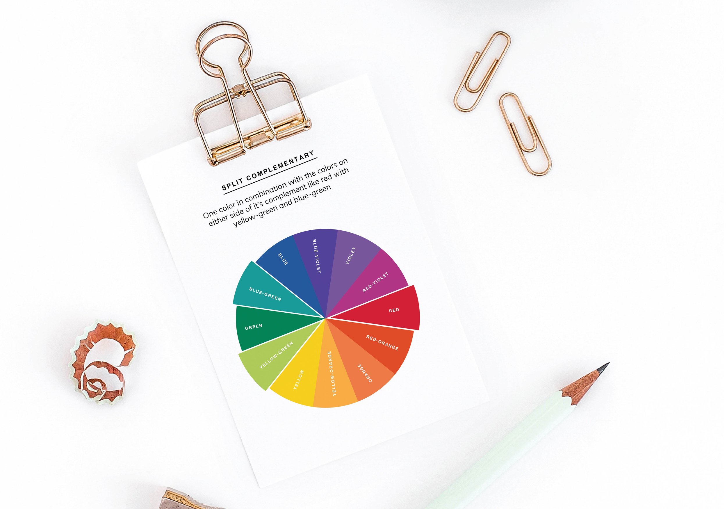
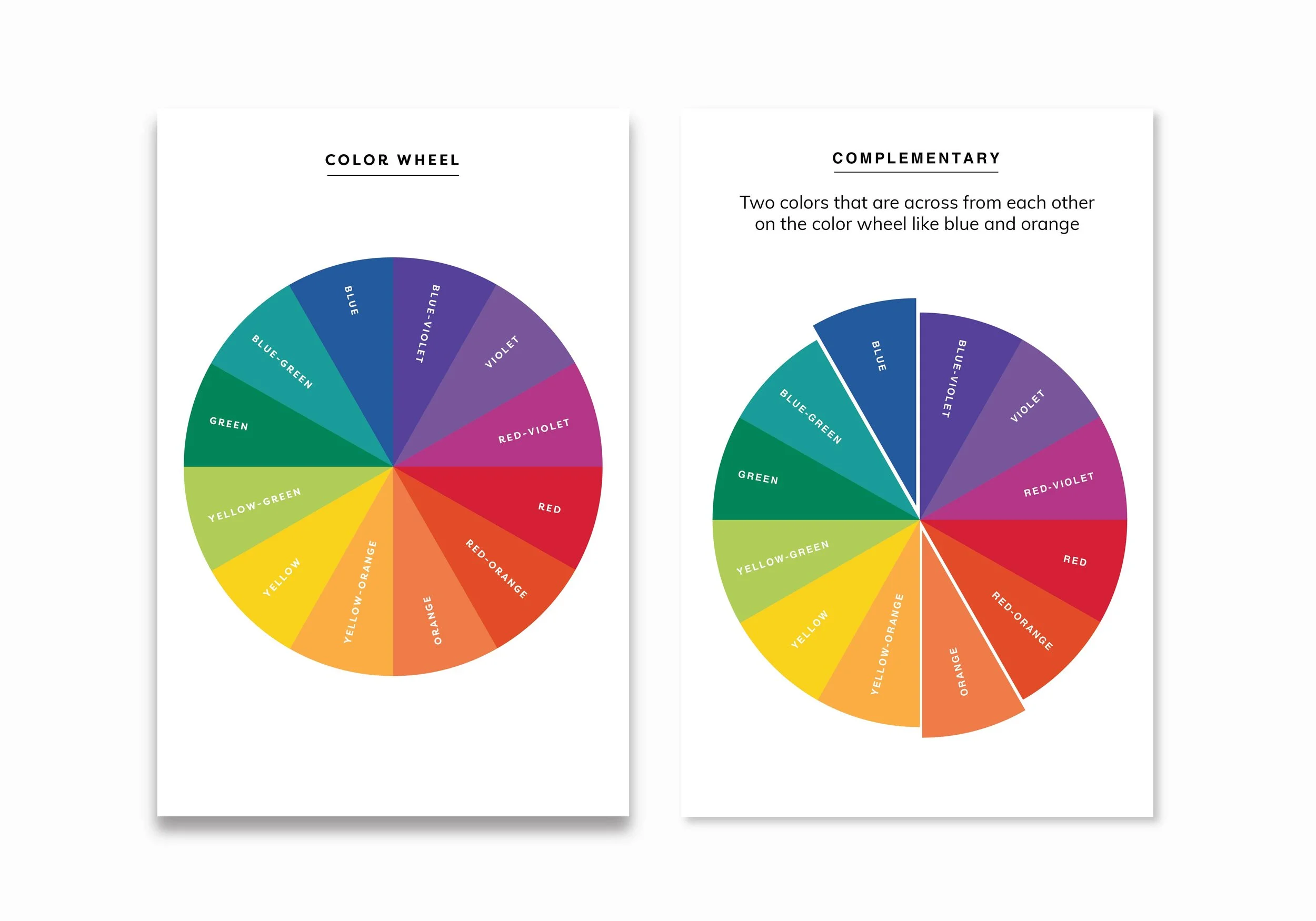
A few color schemes defined:
👉Analogous colors are groups of three colors that are next to each other on the color wheel
👉Complementary colors are colors that are opposite each other on the color wheel
👉Monochromatic colors are colors that have the same hue
👉Triadic colors are three colors that are evenly spaced on the color wheel
Once you’ve decided on your color scheme, it’s time to pick the rest of your colors. To keep things simple, I would start by choosing three colors and 1-2 neutral colors (warm if your colors are warm colors and cool if your colors are cool colors).
You can either use the downloadable color wheel and chart here as one option or you can go to coolors.co and create colors using their website.
If you use coolors.co, click “generate”
• Click on the three dots in a row that will say “more” when you hover over it
• Select “generate mode”
• Select your color scheme
• Click the space bar until you see your main color (the first color you picked)
• Click on the lock icon once you find your color to lock it in place
• Continue to click the space bar when you find your second, third, and neutral colors. Lock each one in place when you find a color you like
• Take a screen shot of your final color palette (command/shift/4)
👉After you have your screen shot, open it in Illustrator. Using the eye dropper and rectangle tool, create 4-5 color swatches.
👉Test all of your colors out by laying them out together on top of your neutral background, medium colored background, and dark colored background and adjust the saturation/brightness until you get a cohesive-feeling palette.
👉The final step is to add your colors to your pattern or artwork and that’s it!!!
If you have any in-depth questions regarding how to use Adobe Illustrator for this exercise, please feel free to reach out to me. I’m always here to help.